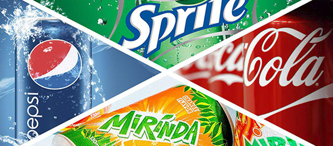
 Discover the five most popular and recognizable logos of soft drinks, as well as the reasons why they work.
Coca Cola
You’d be hard pressed to find an emblem that has been more resilient. Classic Americana and Coca Cola are synonymous.
Why does it work?
Clever use of color psychology and custom font are the two main secrets. While the bright red is a very common color in commercial design, giants like Coca Cola can afford using it without the risk of losing the uniqueness of their brand identity. The typeface clearly matches the personality of the brand.
We can’t but mention the logo of another very popular drink, Dr. Pepper. We can only guess whether it got some of its popularity due to the similarity with Coca Cola or, vice versa, it damaged Dr. Pepper’s recognizability. In such cases, the authors of the logo have to weigh the risk thoroughly – remember the lesson of the Pandora logo, which has been severely criticized for its similarity with PayPal.
Pepsi
Pepsi boasts one of the most recognizable brand logos of all time. It has gone a long way before it adopted its current smooth and minimalistic look, though.
The logo was made with speed and motion in mind – looking at the roundel you may feel the freshness of the drink poured in a glass. Or you may remember an ocean wave with the white cap breaking on the shore, bringing cool drizzle. These ideas in your mind aren’t a mere coincidence – the shapes on the logo remind flowing water.
Monster Energy
This one stands out in the crowd of soft drink logotypes. It’s unique and instantly recognizable. Doesn’t seem to correlate with the “refreshing,” “juicy,” or at least “drinking” theme? To begin with, the designers wanted to put the “energy” theme first.
But the ones mentioned above are also present. Take a closer look at the lime color of the logo and the way the “fingers” remind tiny water streams.
The logo was developed in California-based firm McLean Design.
Sprite
While their old logo with lemon was pretty refreshing, we like the new one as much. The funny shape brings to mind several connotations. Doesn’t it look like the splash of cool water you’ve been dreaming about? Doesn’t it remind a character from a cartoon (two ears, two hands, two legs)? Moreover, the Spritelogo features one of the most refreshing colors possible – green.
Mirinda
Sun and freshness of the orange juice – these are the images conjured up by this joyful and vivid logotype. Even before you buy the beverage, you may feel the taste of the orange drops due to the design.
Methodology
In this ranking, we didn’t focus on indicators like market value or profits of a given brand (such things should be betters left to Soft drinks concentrate market research).This ranking was created based on purely artistic qualities of the logotypes in question.