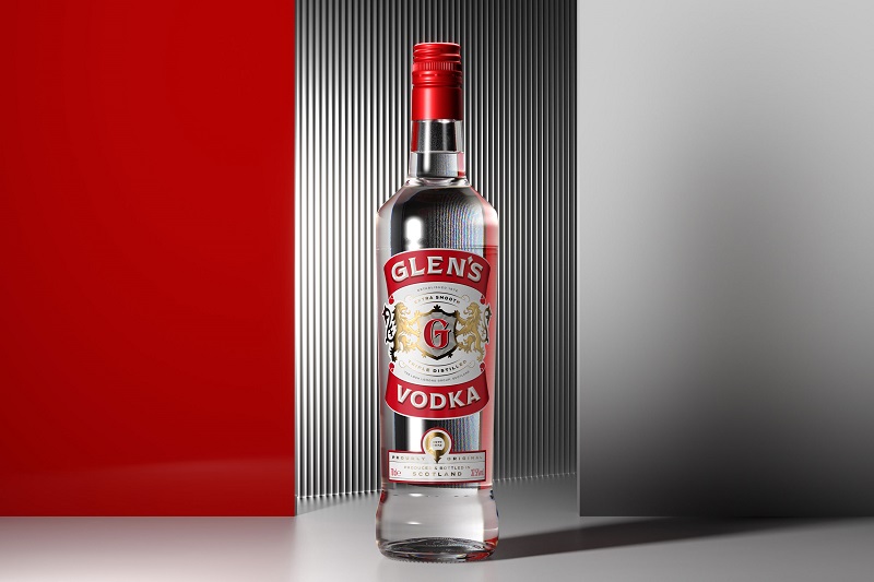
Glen’s – has refreshed its brand identity to help pave the way for growth into new markets.
Glen’s Vodka: Infused with Scottish Spirit by Thirst Creative Agency
Owners The Loch Lomond Group turned to Glasgow-based creative agency Thirst to orchestrate Glen’s brand evolution as it targets a more serious end of the market, celebrating its Scottish provenance.
The iconic Scottish brand was launched in 2003 and Thirst’s reimagining of the Scottish spirit is the first significant overhaul of its packaging in almost 20 years.
Thirst’s primary challenge was to overcome the brand’s ‘drifting sense of identity’ – which had become a threat to perceptions of quality and the brand’s growth.
The 25-strong agency’s strategy was to lean into Glen’s roots and reposition it as ‘a Sip of Real Scottish Spirit’, giving the brand renewed relevance with new and existing consumers.
“For over 20 years Glen’s has been part of the fabric of Scottish culture, synonymous with so much of what the nation is famous for – its sense of wit and fun,” Thirst’s Creative Director Matt Burns explains.
“Yet with ongoing fragmentation and a drifting sense of identity affecting quality perception and impeding growth, it was time to reassess the brand direction.
“We wanted to move it away from emulating inauthentic provenance and instead take pride and confidence in its own roots, at the same time retaining its distinct demeanour and straightforward quality that appeal to smart, value-seeking consumers and bring a refreshing lift to the category.”
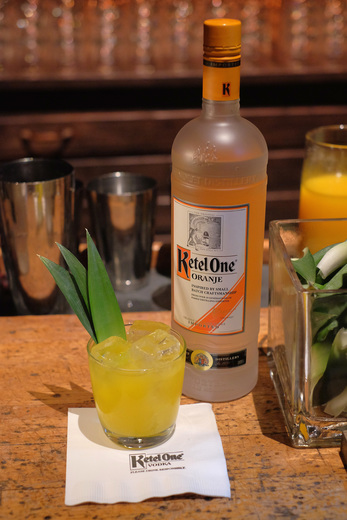
Read Also: SaltRock Launches Revamped Fall Menu – Food & Beverage
Thirst’s rich visual contemporary reimagining of Glen’s Vodka is based in its heritage. A red, white, and gold palette remain, as do lions on the brandmark, but they have been recrafted to amplify the brand’s reliable taste experience, along with a simplified monogram and the addition of a quality panel which together add authenticity and origin to the product story.
Refreshed and modern typography against the core palette of red and white underpin provenance, process, and experience as the basis for Glen’s off-pack brand and product messaging – ‘Proudly Original’, ‘Extra Smooth’, ‘Triple Distilled’, and ‘Produced and Bottled in Scotland’.
The same extends into Glen’s ongoing campaigns, including its ‘Spirit of Football’ sponsorship of the Scottish Professional Football League (SPFL).
“With a fresh new story to tell and visual equities to convey it, this fresher, more modern Glen’s stakes its claim to everyday quality, and paves the way for the brand’s braver growth ambitions,” Burns added.
The reimagined Glen’s Vodka is available now. For more information on Thirst, visit thirstcraft.com